BIO RAW | Radically Good.
Packaging Design, Brand Refresh + Art Direction
The objective for updating the BIO RAW branding was to refresh and improve balance and legibility issues with existing branding. The outcome is a flexible and scalable logotype that maintains readability and impact across a number of diverse applications. The brand refresh was aimed at reaffirming the BIO RAW name as a “stamp of approval” and an industry leader in serving Radically Good Food that is certified organic, vegan, and zero-waste.
Photography: Doaa Jamal, Jeremie Dupont, Kailee Mandel
Packaging Design, Branding + Art Direction: Josh Singler
CEO + Creator: Oren Epstein
Packaging Design, Branding + Art Direction: Josh Singler
CEO + Creator: Oren Epstein

Objective
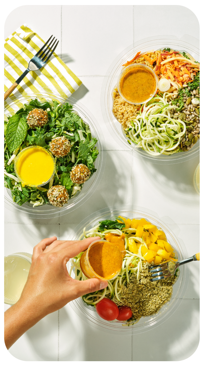
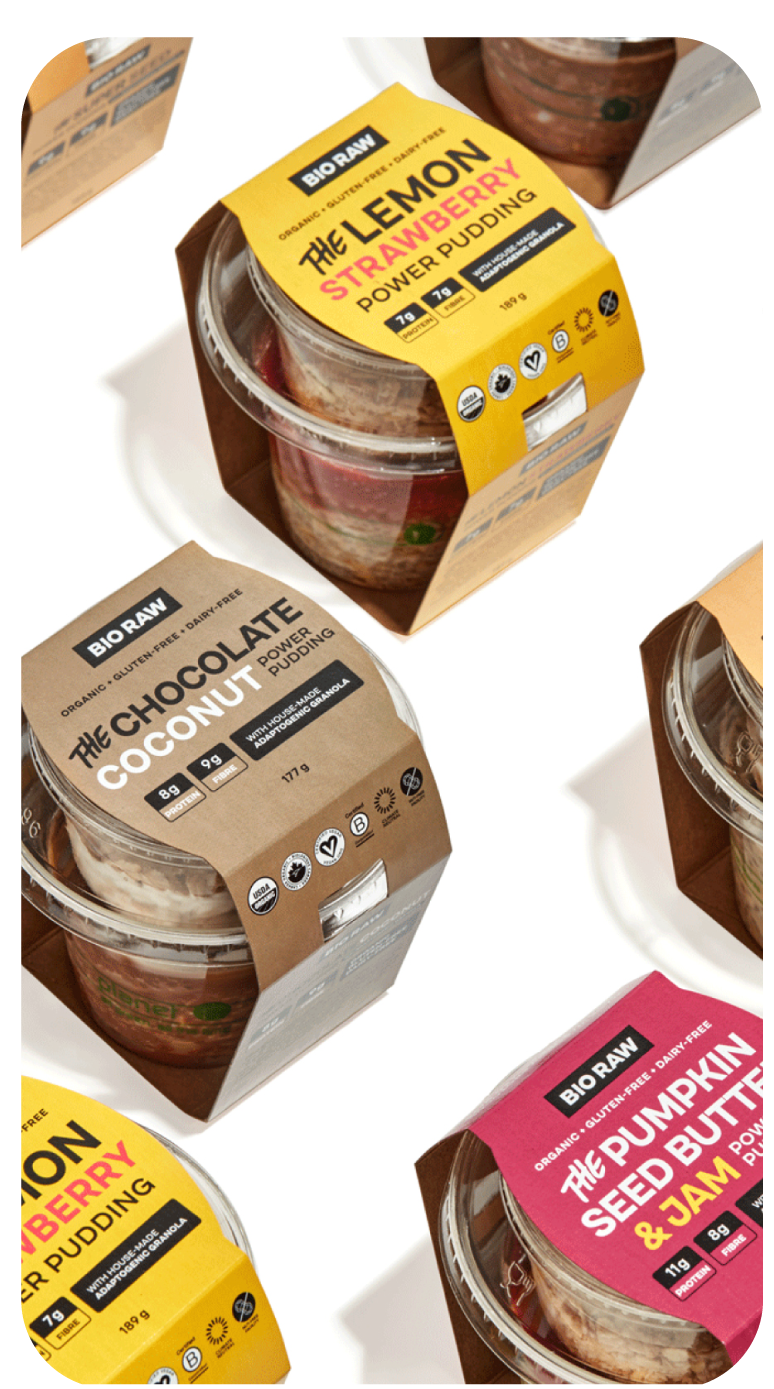
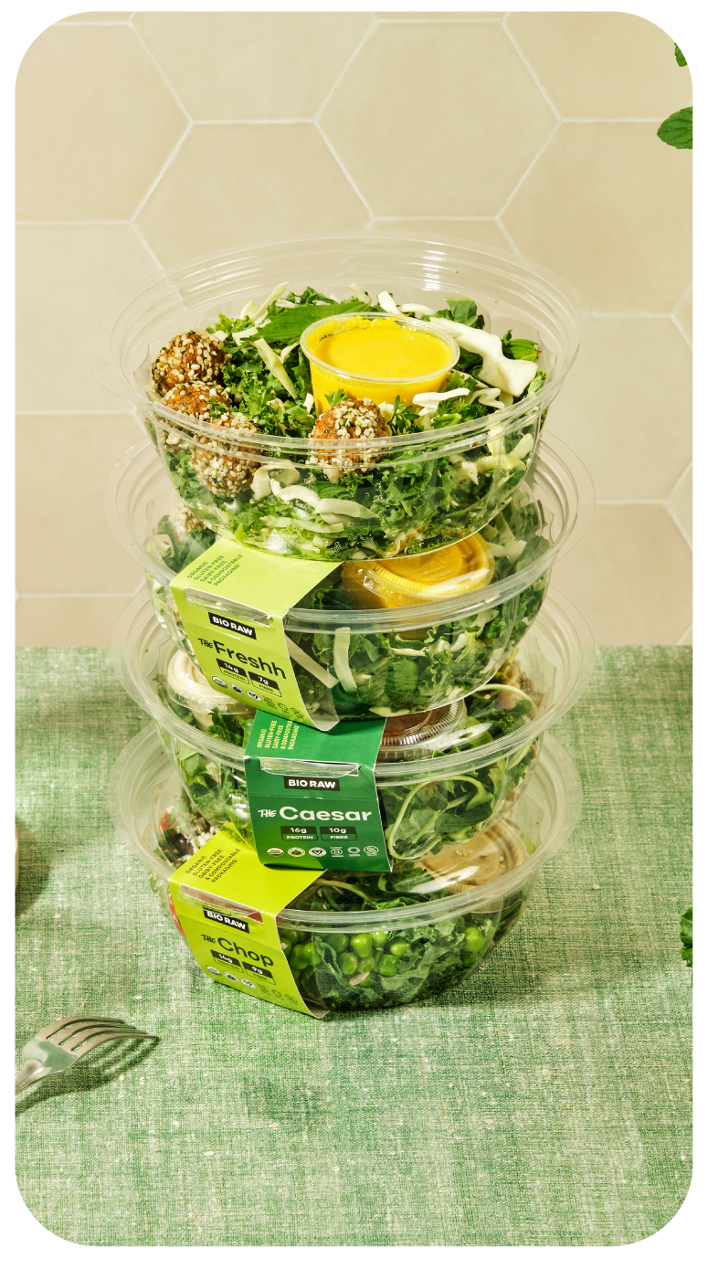
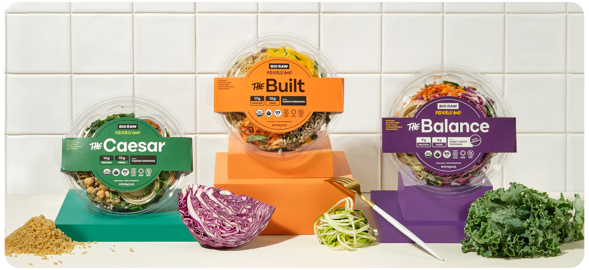
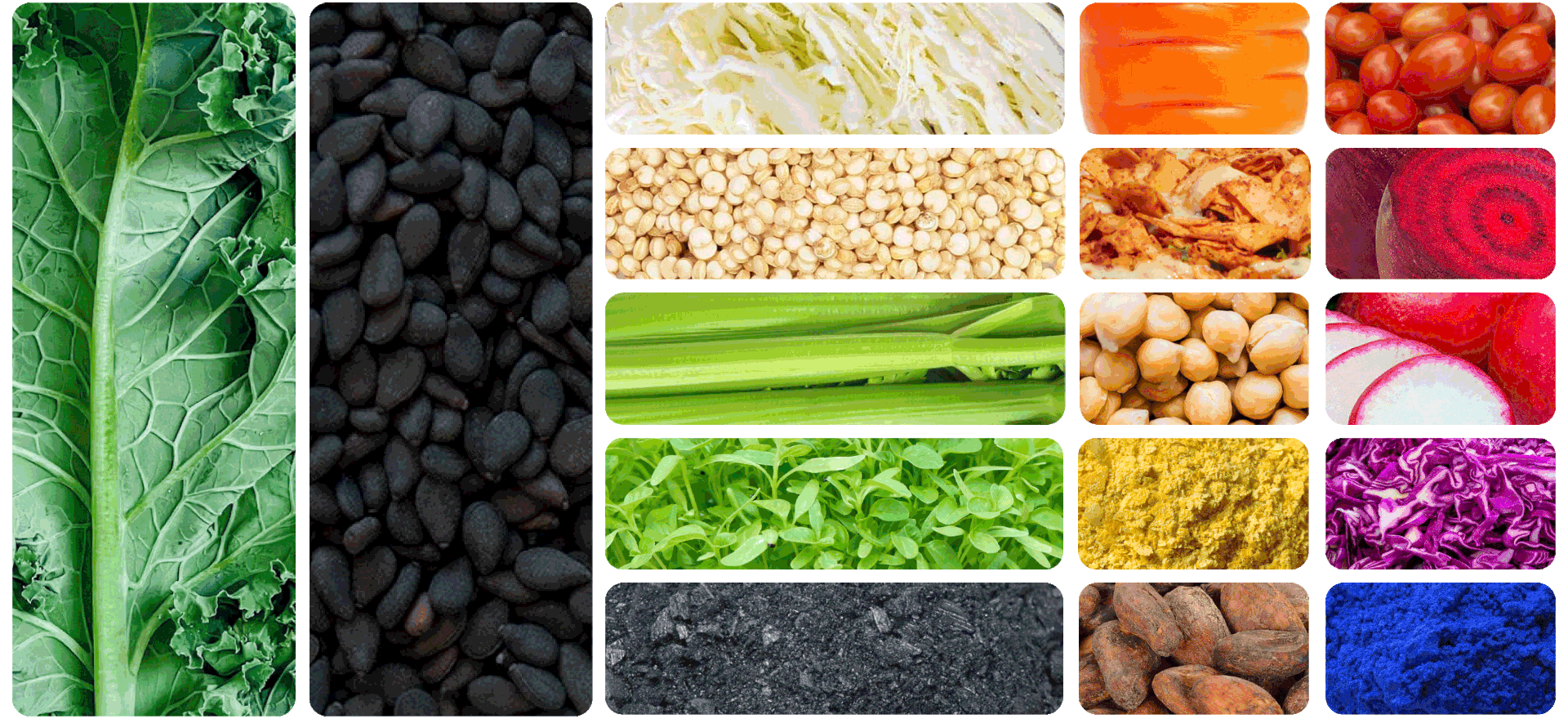
Colour plays a central role in the BIO RAW brand refresh. The fresh color palette takes inspiration from the earth, embracing the beautifully rich hues it offers. Each colour was developed and named directly from the ingredients in the product range.
The brand book supplies a comprehensive overview of the primary, secondary, and tertiary colours within the colour palette below, along with practical examples of when, where, and how to use them. This extensive color palette empowers those interacting with the brand to unlock limitless creative possibilities, enabling BIO RAW to continuously evolve and reinvent itself to suit various landscapes and audiences.
Process
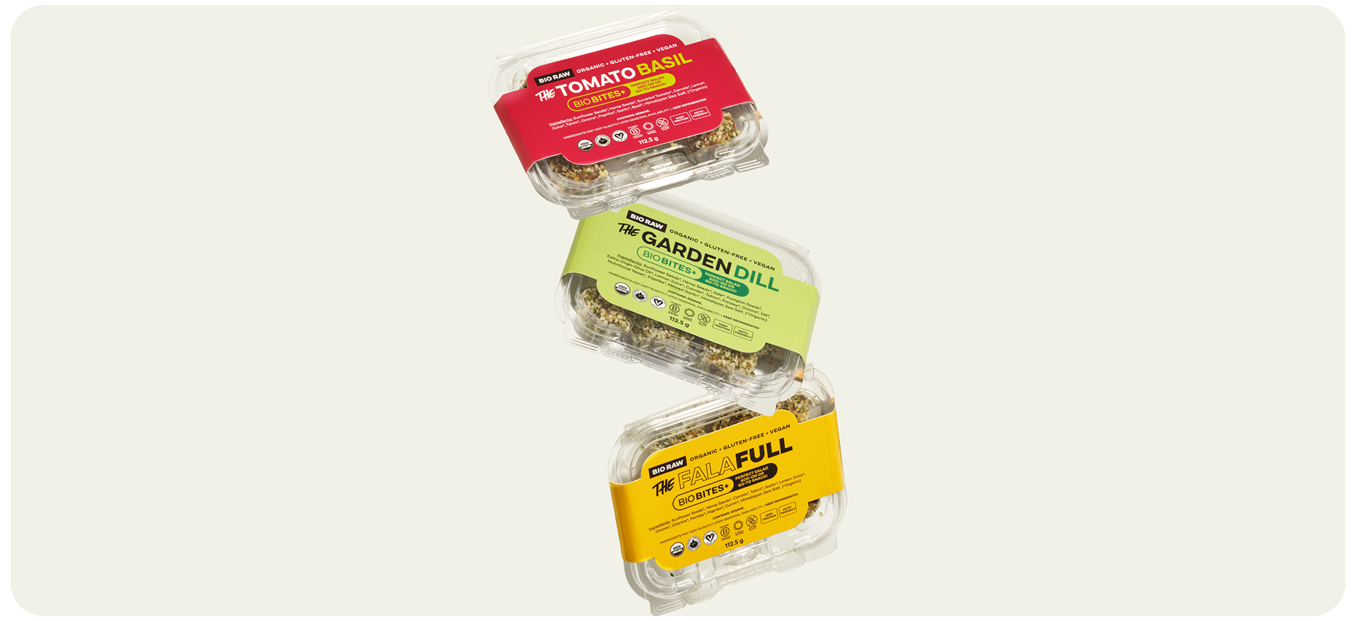
Over the past five years, BIO RAW has cultivated a dedicated customer following. I felt it was important to craft distinct identities for each of the salads but also lay ground for future product offerings like their BIOBITES+, Power Puddings, dressings and beyond. In choosing typefaces, colours, and designing text lockups I wanted to maintain a sense of familiarity and recognition among their existing customer base but also create something that enticed and educated new customers.
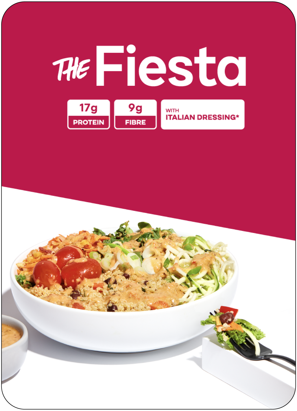
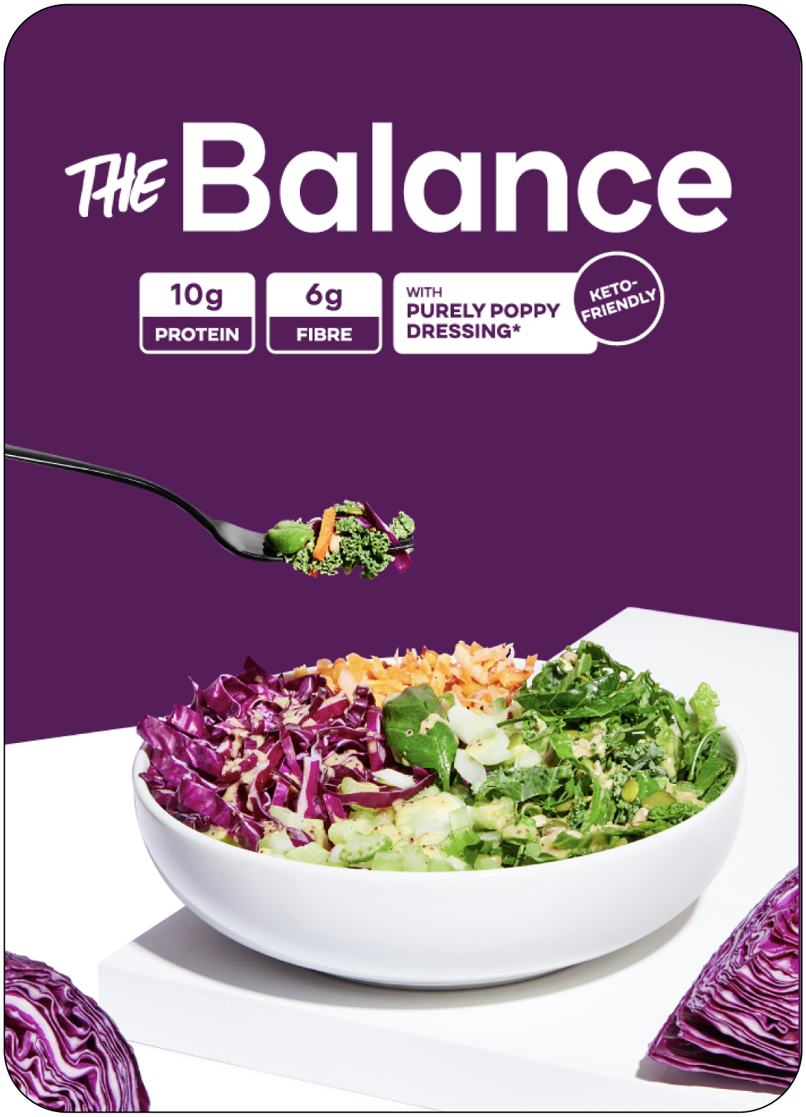
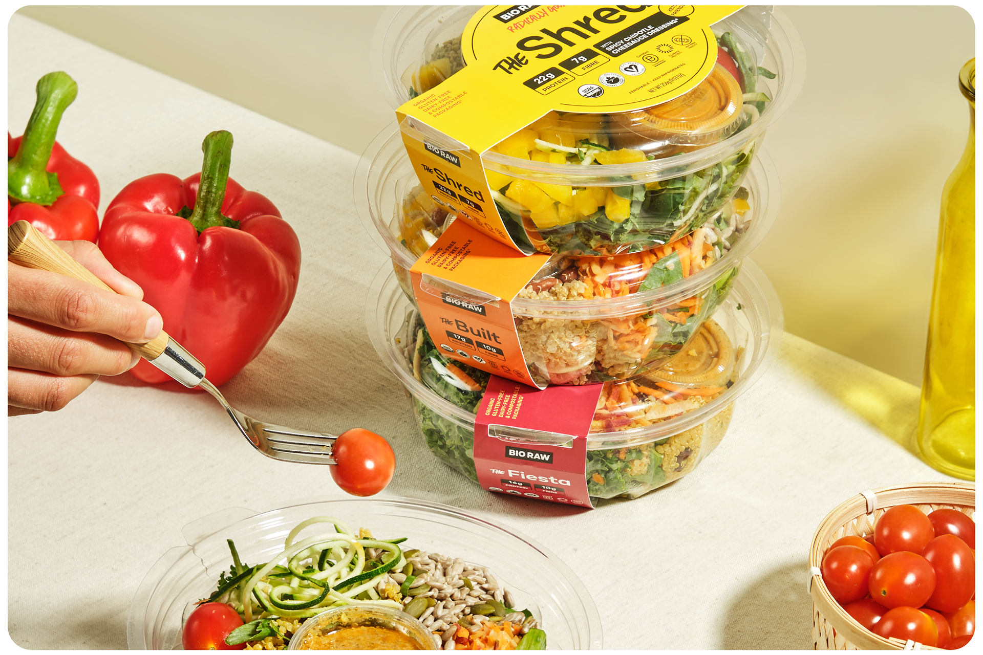
Packaging Design
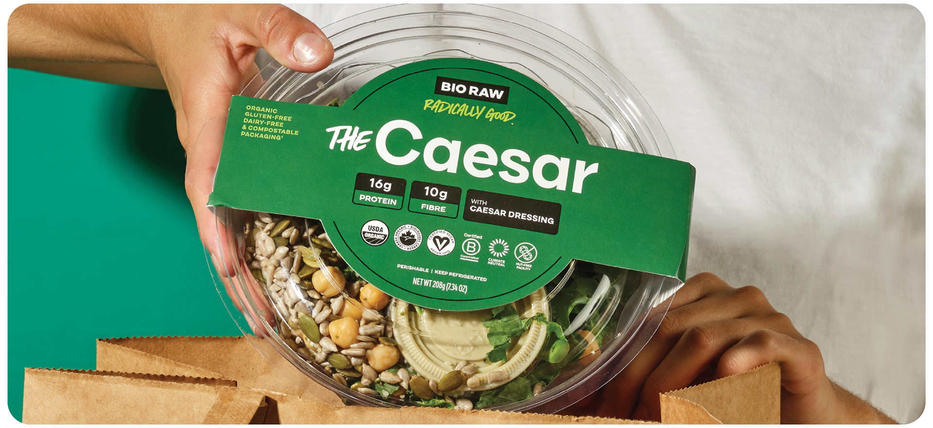
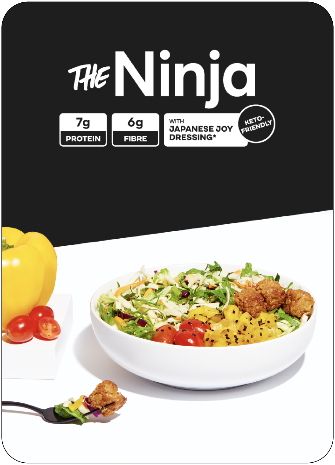
A significant portion of BIO RAW's sales takes place in grocery stores across Toronto and the GTA. Consequently, it was imperative for me to emphasize specific details for each salad, particularly their protein and fiber content because people interact with this packaging in-person on store shelves. I created text lockups and design framework that allowed these elements to be highlighted without taking away from the rest of the packaging.
Equally crucial was the thoughtful selection of colors to complement each salad, as these elements collectively played a pivotal role in accomplishing the desired impact and identity of each salad.
Equally crucial was the thoughtful selection of colors to complement each salad, as these elements collectively played a pivotal role in accomplishing the desired impact and identity of each salad.