A Gift in Every Sip.
Design Management, Art Direction + Styling
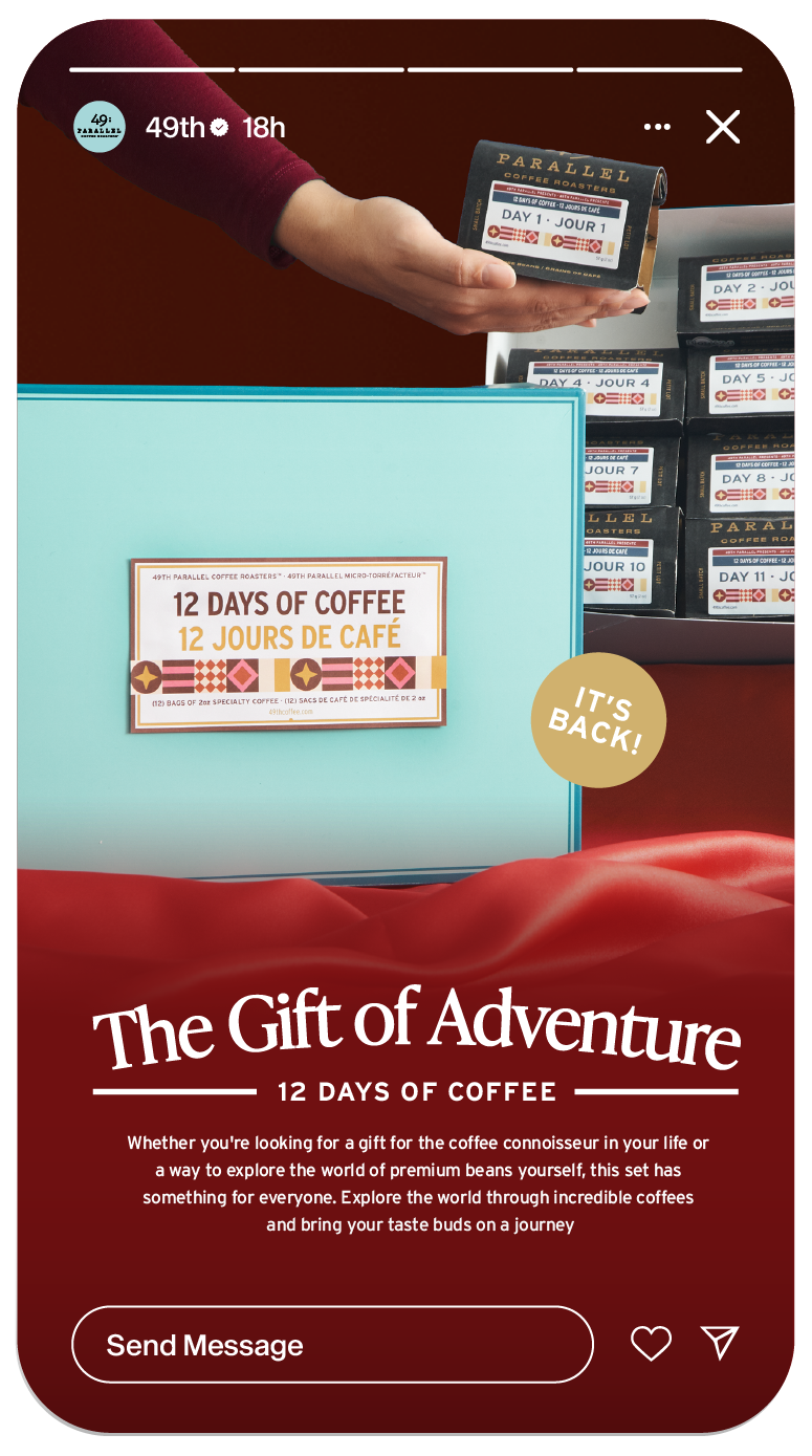
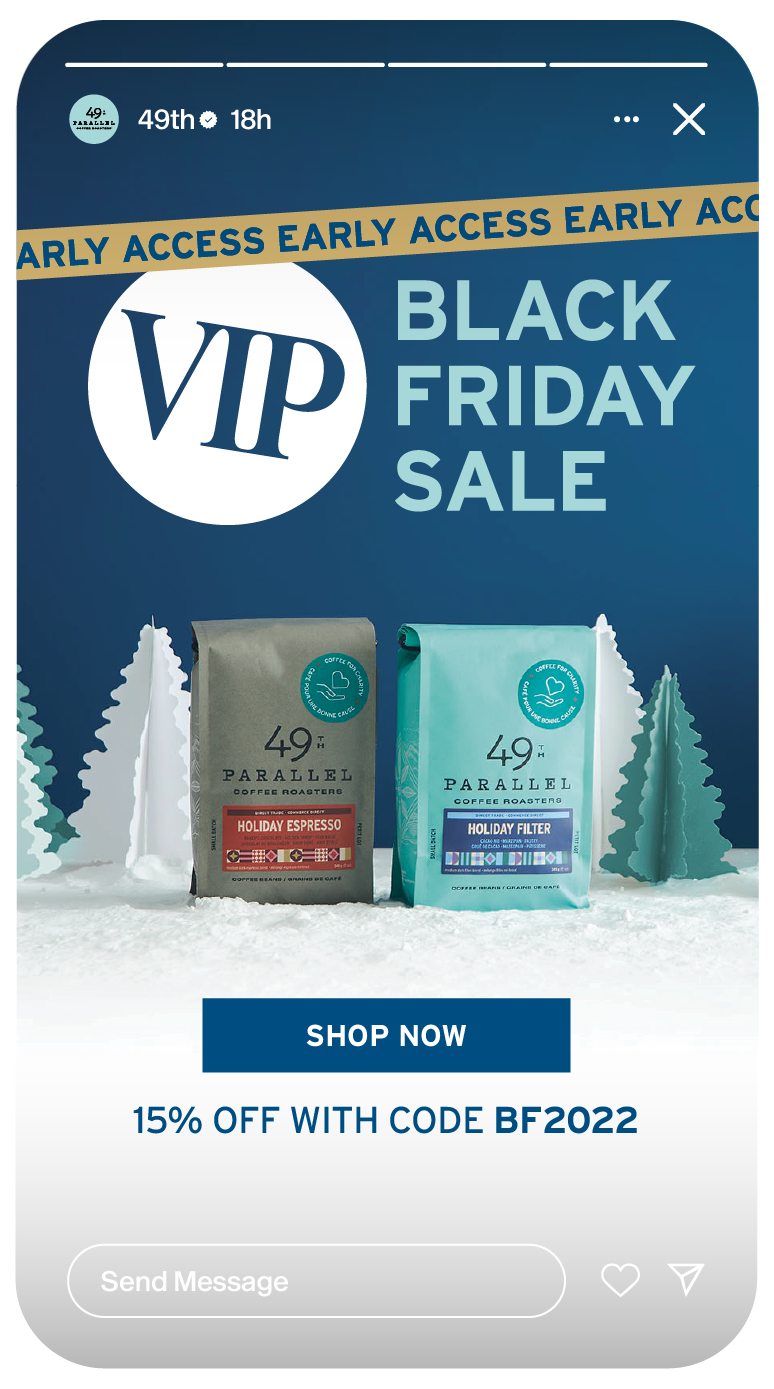
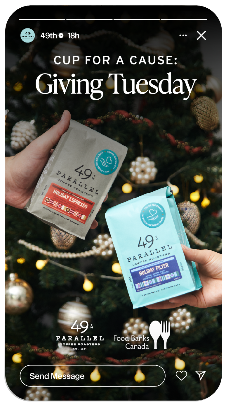
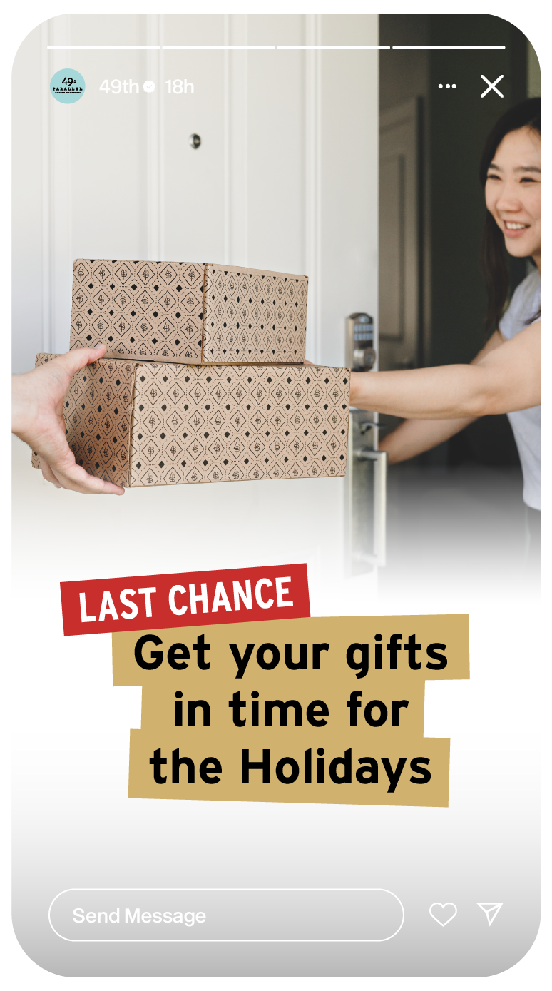
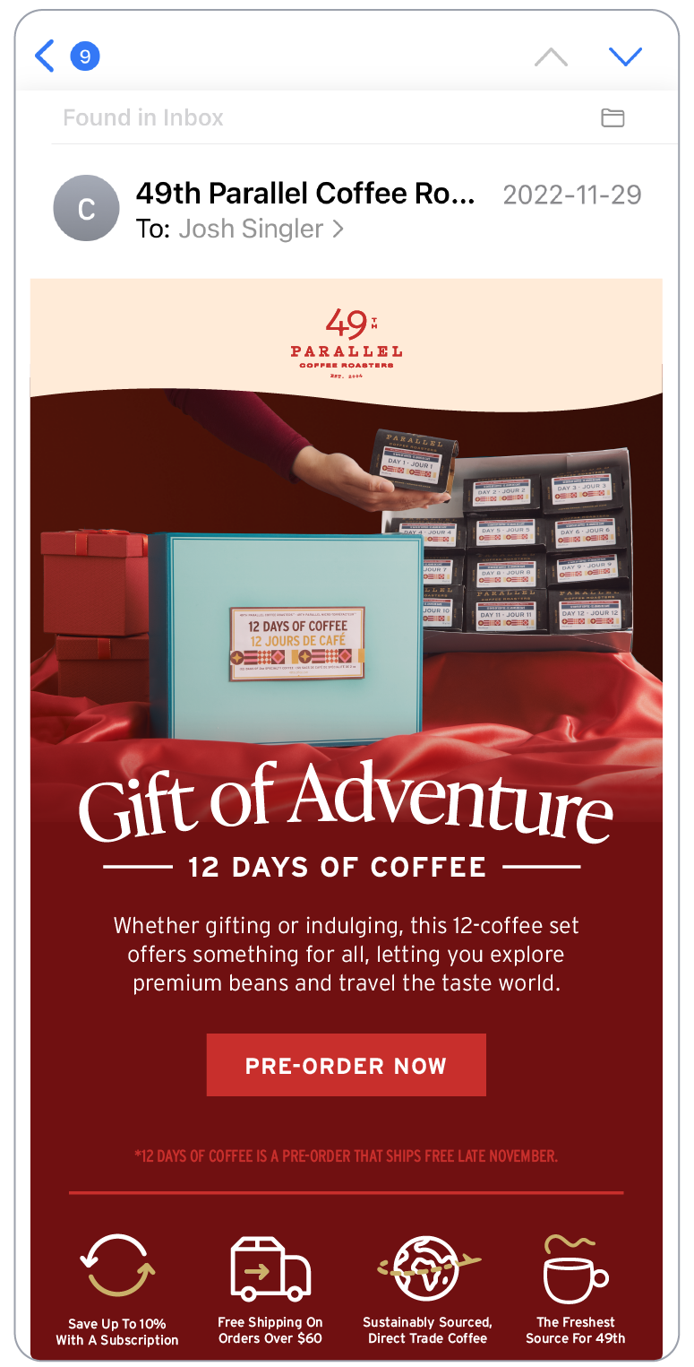
During the holiday season, 49th Parallel Coffee Roasters releases a special catalog of exclusive holiday coffees, brew gear and merch. My role involved crafting a campaign that would extend across various channels, both virtually and in-café. The outcome was the campaign 'A Gift in Every Sip.', characterized by a warm and familiar color palette that is harmonious with existing company branding.
Collaborating with a small but mighty team, my responsibilities included curating shot lists, conceptualizing and building various on-set props, directing the shoot, and subsequently establishing design standards and templates for the junior designer to follow.
Photography: Dani Costello, Devin Gallagher
Art Direction, Styling + Design: Josh Singler
Junior Designer: Nick Creamore
Ecommerce: Reid Adrian, Yesul Yung
Executive Chef: Karly Pommes
Assistant Executive Chef: Sonia Shah
Art Direction, Styling + Design: Josh Singler
Junior Designer: Nick Creamore
Ecommerce: Reid Adrian, Yesul Yung
Executive Chef: Karly Pommes
Assistant Executive Chef: Sonia Shah
Campaign Identity
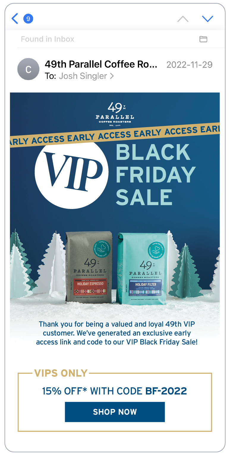
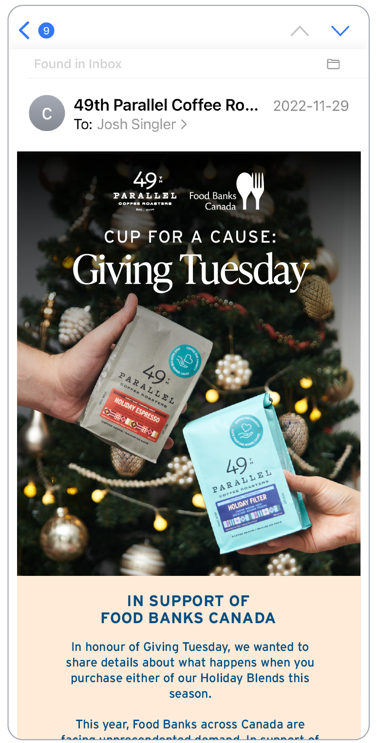
I chose the typeface 'IvyPresto' as a font to pair with the existing company typeface 'Interface' to soften the overall feeling of the campaign visuals. While crafting the campaign's identity, my goal was to maintain an elevated aesthetic while ensuring adaptability throughout the evolving holiday season. I devised two distinct color palettes to differentiate the company's primary holiday offerings: the Holiday Espresso Blend (Red Palette) and the Holiday Filter Blend (Blue Palette), with gold and cream serving as complementary accents for both.
Cross-Platform Functionality
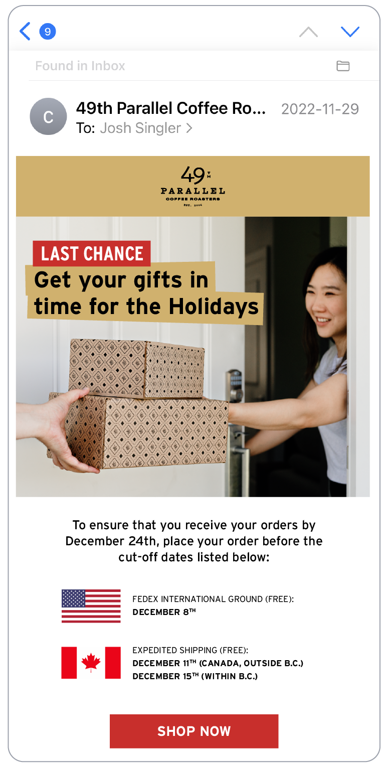
I wanted to develop and implement visuals that not only boasted an appealing aesthetic but also exhibited functionality across multiple channels, including our eCommerce platform, social media profiles, email newsletters, digital advertising, printed materials, as well as in specialty grocery retailers and in-café displays. My approach was to design each set of visuals with their own unique identity that seamlessly integrated into the overarching holiday campaign.
Hot Chocolate Festival 2023
Each year, 49th Parallel Coffee Roasters participates in the Hot Chocolate Festival, crafting two distinct combinations of hot chocolate paired with a complimentary doughnut. My primary goal for this year was to accentuate the individuality of each pairing, showcasing their unique flavors through the strategic use of visual props, photography composition, and post-photo manipulation techniques.
Art Direction
The goal for these photoshoots was to produce visually captivating still images that could effectively convey our message across various platforms. While the majority of the elements you see below were captured in the initial shots, I conducted post-shoot photo manipulation to enhance details such as backgrounds and the interior of the coffee mugs to compliment the recipe and ingredients.
In-Café Signage
The creation of the in-café signage framework stemmed from the absence of pre-existing templates or guidelines for promoting drink specials. My intention was to establish a system that not only aligned with the company's specialty coffee mission, but also ensured legibility and visual engagement. Subsequently, this template was implemented for all seasonal beverages moving forward.
